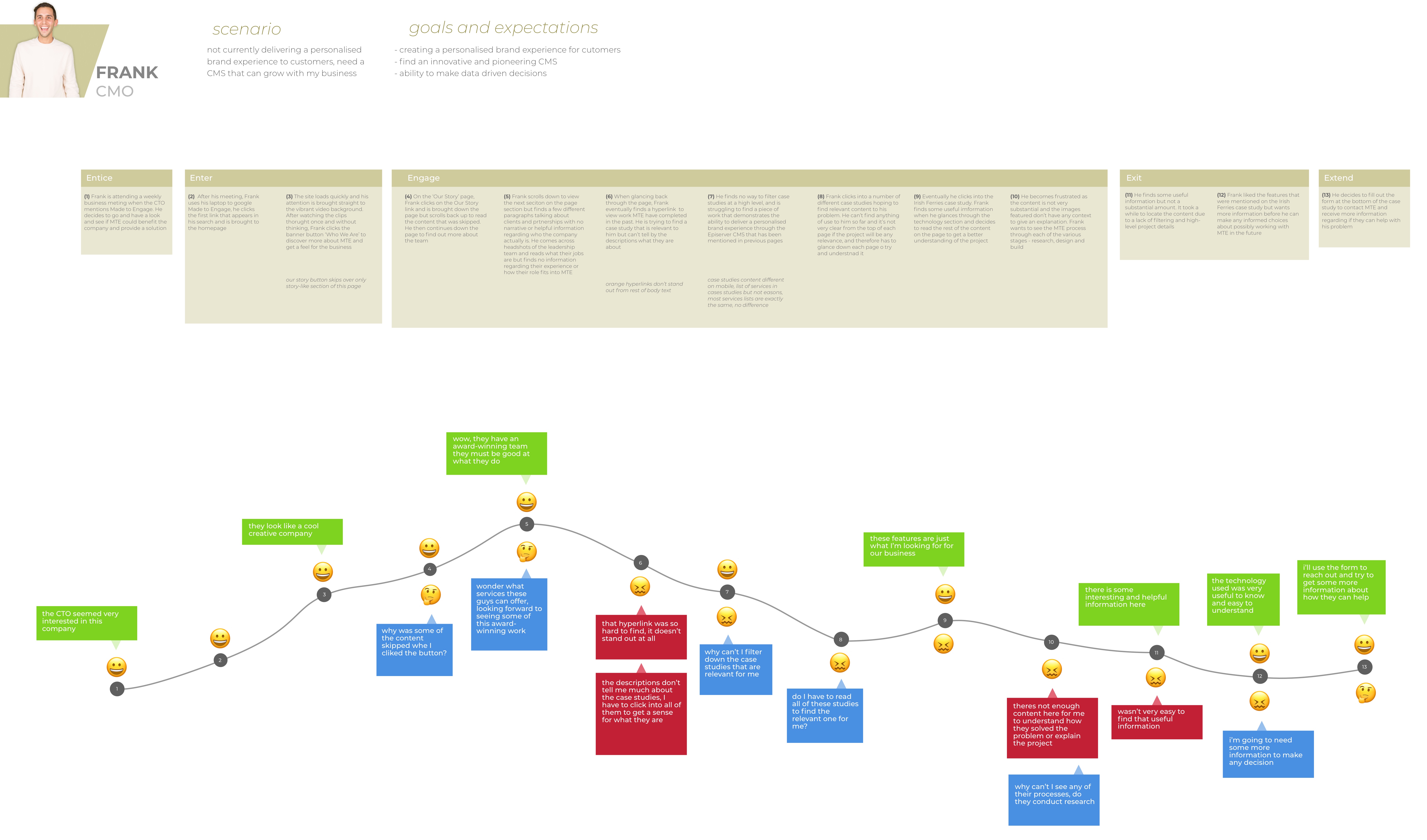
Well you may think this but there is a reason why two different words are used here. Where user flow tells the story of how a user accomplishes a task on your website, user journey details this story but also the steps taken to reach your site and what they do afterwards. It’s pretty much the bigger picture.
Having a user flow diagram can be extremely useful and worthwhile. It helps ensure that the user is having the best possible experience on your site. It allows us to plan pathways to certain pages or actions using the fastest and most logical route. This could be to push a sale or have people sign up for an email newsletter.
Another benefit is that you can quickly and easily spot issues with the flow of the site and find a solution to avoid them.
Creating a purposeful user flow can help you guide people intentionally through your site and towards the action you want them to take without having to rely on their wish to explore. – Newfangled.com
Without exploring the user flow of a site, you could end up with a confused user who misses the whole point of your website, this can have disastorous effects for both the user and yourself.
To start it can be helpful to understand just how the user has come to end up on your site. There are a number of various paths known as Entry Points
- Direct entry: where they come straight to your site
- Organic search: where they find you via a search engine
- Referrals: where they follow a link from another site
- Social media: such as Facebook or Twitter
- Email marketing: email newsletters, email campaigns
- Ads: paid ads on other sites, Google AdWords, sponsored posts
These are important to know and consider as it can change how the user interacts and intends to use your site. For example someone coming from a search may spend sometime exploring the site, whereas a user coming from an ad may be interested in just one aspect of your site.
The navigation of your site should be less like an obstacle course and more like a wind tunnel
From learning all about the flow of your website, you can then start to optomize your website for the user and continue to add improvements.
Don’t just design for the first conversion such as signing up for your newsletter, but for the ultimate conversion which is deciding to buy your products or services. You need to keep the ultimate goal in mind to design your website user flow properly. – Smashing Magazine
