Today is the day. You’ve saved up and decided to go buy that new phone you’ve been dreaming about. You step into the shop only to discover the phone is going to be a nightmare to find as products are randomly scattered throughout the shop in no particualr order. As you are looking around for that phone staff keep coming over attempting to sell you other products even though you’ve told them you’re not interested. When you finally find the phone you realise there are so many variations, all with no explanation. When you go to ask a staff member for some help no one can be found. You’ve finally chosen your phone and made your way to the till where the cashier seems eager, almost incessant, for you to join their reward scheme that just so happens to also sign you up to their newsletter.
If you hadn’t already, it’s at this point you would probably run out of that shop screaming. Most people would think this experience sounds like a nightmare, a shop that treats it’s customers that badly could never exist. However the reality is that everyday we use e-commerce sites that treat us exactly like this whether we realise it or not — endless popups and adverts, no logical categorisation, unclear prices of products, lack of available help, and being forced to sign up for accounts. Vitaly Friedman, Editor of Smashing Magazine said that “the difference with online and offline shopping is that we’re used to suffering when buying online”.
Each of these pain points ruins the experience and can damage relationships with potential customers. Retailers should consider the customers perspective at every point of the journey to create a delightful experience. I want to focus on three crucial touchpoints and things to consider.
Pricing
This is what customers are looking for, how do your prices compare to elsewhere. This, therefore, makes it one of the most important aspects of e-commerce.
Pricing should always be clear and obvious to the user, helping encourage them to purchase from your site. To help users find prices quickly, pull them out from the page design. If needs be, A/B test various layouts of product pages to find out which converts customers the best.
If selling across multiple regions, give users the freedom to change to their local currency across the site. It’s easier for customers to make decisions when they understand the value relevant to them. This prevents users having to do any extra thinking when browsing products, making a seamless transition into the checkout flow.
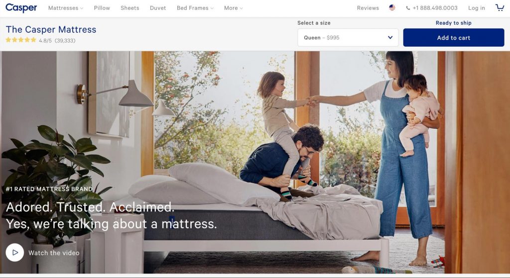
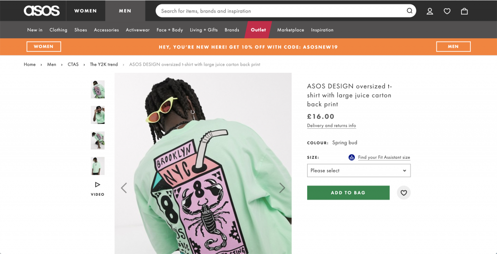
In the first example seen on ‘Casper’ the price is not obvious, making the customer do a lot of work and causing unnecessary frustration for them. This might make them more likely to leave the site. However, the second example from ‘ASOS’ makes the price much clearer. Prices are emboldened to stand out from the surrounding content.
Shipping
Just when you think you’ve found an absolute bargain, a small part of you dies inside as you realise the product doesn’t include free shipping. Hidden fees can be some of the most frustrating for users during the checkout flow. 53% of customers abandon their cart during checkout due to extra costs such as shipping, fees, and tax being too high (Baymard 2019). This seemingly small amount is more than the customer had committed to spending on this purchase, Shopify says “It disrupts their thought sequence and affects the buying experience”. By not providing any information for users before they enter the sales funnel, it does not properly set a users expectations. A majority of users go through the full checkout process to the final confirmation screen in order to see the ‘actual’ price it’s going to end up. Smashing Magazine said that “Going through the checkout flow to the final page goes to show how little we trust retailers”.
One way to improve this experience is to be upfront about any extra costs, particularly shipping. Retailers could offer free shipping for orders within a certain country or over a specific cost. Alternatively, provide clear information upfront to customers about the cost of shipping, allowing them to factor this into the final price.
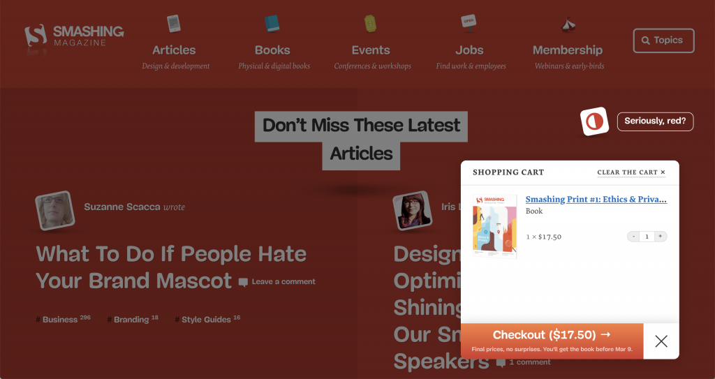
Smashing Magazine go that bit further when users purchase products from them. Their basket shows users the final price when items are added. They use the tagline ‘final prices, no surprises’ to reassure to users in a delightful way. They have instantly set the users expectations, allowing for a seamless transition into the checkout flow.
User Accounts
“Nobody wakes up in the morning hoping to finally create an account that day” (Vitaly Friedman). This is a common disruption seen in checkouts. In the era of online privacy and data breaches, customers are more sensitive to giving away information. 31% of customers abandoned their cart as the site was forcing them to create an account (Baymard 2019). This is a huge percentage of customers dropping off and moving onto another site to purchase a product. To add to this Blue Research discovered that 92% will give up if they don’t remember a password or user name.
Create a better experience by not forcing users to create an account. Make this optional. Highlight key benefits of having an account, but make sure it’s from the users perspective rather than the retailers. Make optional account creation delightful by offering it to users after making their purchase. At this point you already have an email address, all they need to do is create a password.
Alternatively, include options for Single Sign On (SSO), for example users could use a social media account such as Facebook or Google. This can speed up the process of creating an account to help encourage new sign ups.
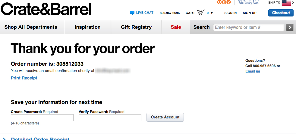
Crate & Barrel allow users to create a password on the confirmation screen. By placing account creation after purchase, it removes the distraction from their task of completing a purchase.
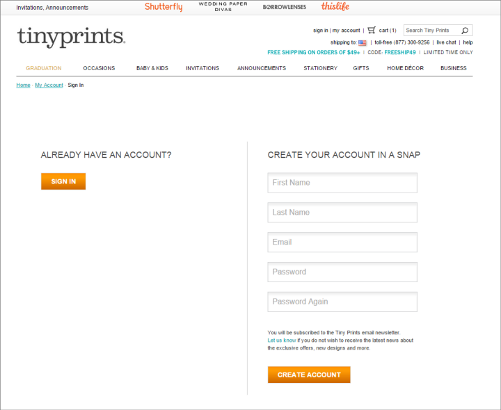
Tinyprints forces users to create a full account at the beginning of the checkout flow. This becomes a barrier to the user moving forward with their purchase and ultimately could prevent new business.
Retailers should be customer focused when making decisions. As mentioned at the beginning, all these pain points cost money. In a Survey carried out by HubSpot 80% of respondents said they had stopped doing business with a company because of poor customer experience.
So does having a delightful e-commerce experience make a difference? Absolutely, according to Nielsen Norman Group businesses that spend only 10% of their budget on usability (an area within user experience design) improvements see, on average, a 135% increase in their desired metrics.
Improving the users experience = positive impact on a business — improved reputation for brands, genuine customer loyalty, and increased revenue.
