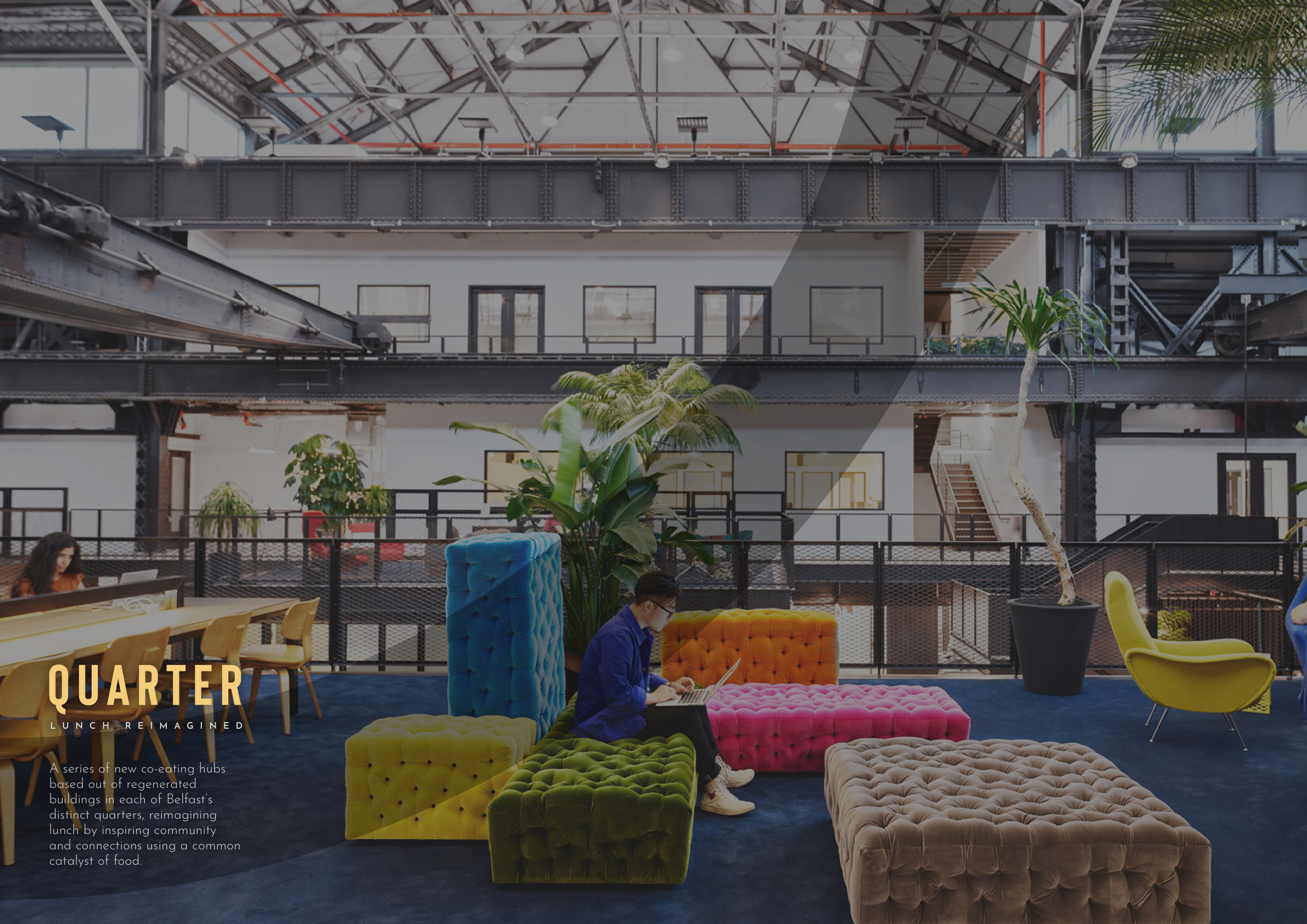
Quarter
Lunch, Reimagined
Overview: A series of new co-eating hubs based out of regenerated buildings in each of Belfast’s distinct quarters, reimagining lunch by inspiring community and connections using a common catalyst of food.
Created: November 2019
Skill: Branding, UX Design, Ideation, Problem Solving
Role: Designer
Further Reading: Tumblr Blog
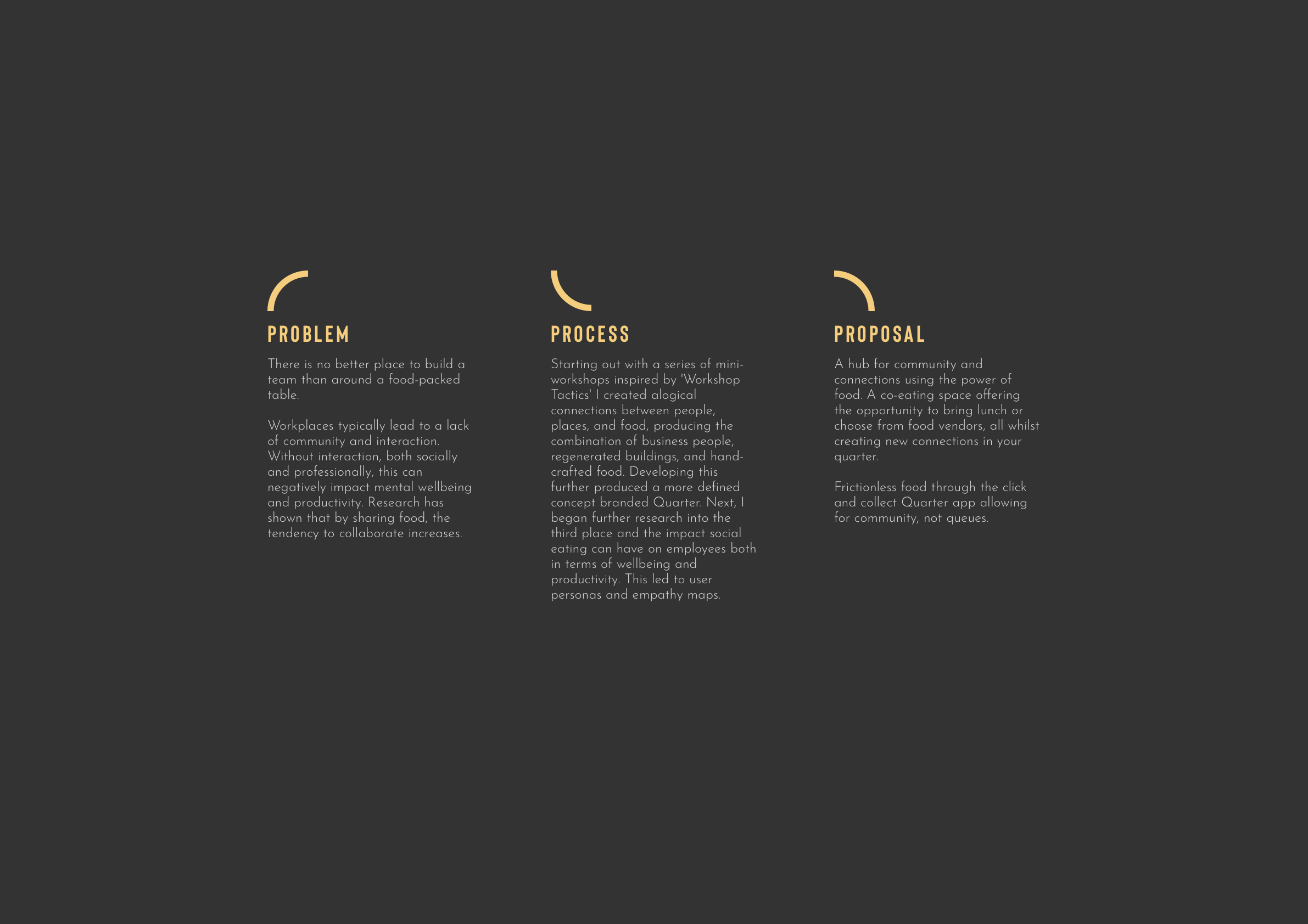
How might we reimagine common spaces to build diverse communities through food?
This was the brief for the RSA Student Awards. The challenge was to create and develop a solution that helps bring people together using food as a catalyst.
From looking at the toolkit and talking with peers, there seemed to be more of a sense of belonging and community in villages compared to cities which can be much more isolating. Focusing on Belfast as a city was an interesting landscape to set my project in. By thinking about this feeling from a village community, I looked at understanding how this can be brought into our city and provide places for people to meet and connect together, taking away this feeling of isolation that can typically be created in cities.
This project can be refined to a simple idea. Placemaking through food. What is placemaking? It’s intervening in spaces to give them more of an identity and area for people to visit. This is what my project hoped to achieve through the medium of food.
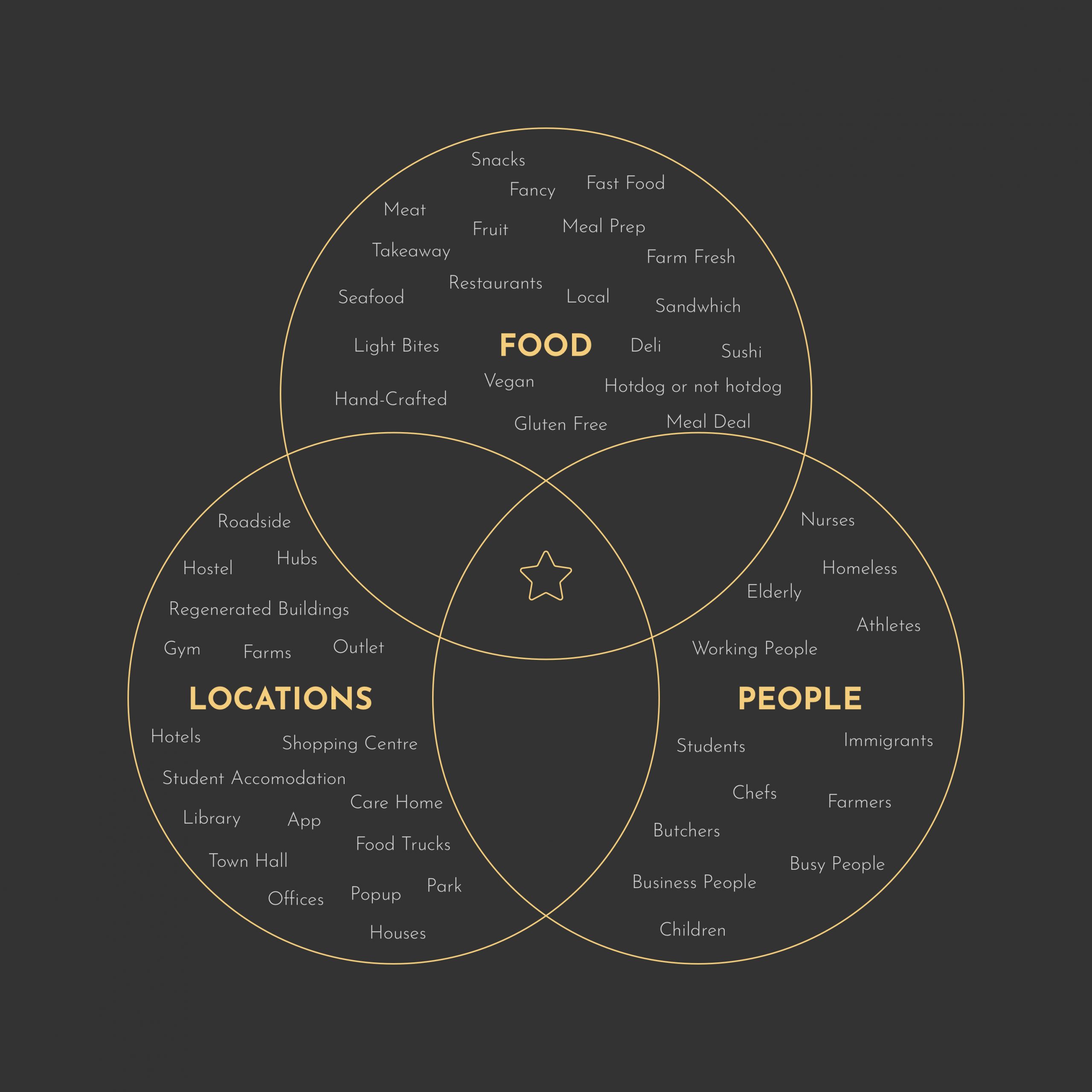
Using a three-way venn diagram, I thought of different audiences, locations, and types of food. From these I selected three of each and matched them up. This creates alogical connections that might otherwise have been missed due to us naturally pairing up ideas that we are comfortable with or that we ‘think’ may work well together. Manually matching items up creates basic ideas that don’t create any new ideas or challenges for my project.
Idea One
Business People + Regenerated Buildings + Hand-crafted Food
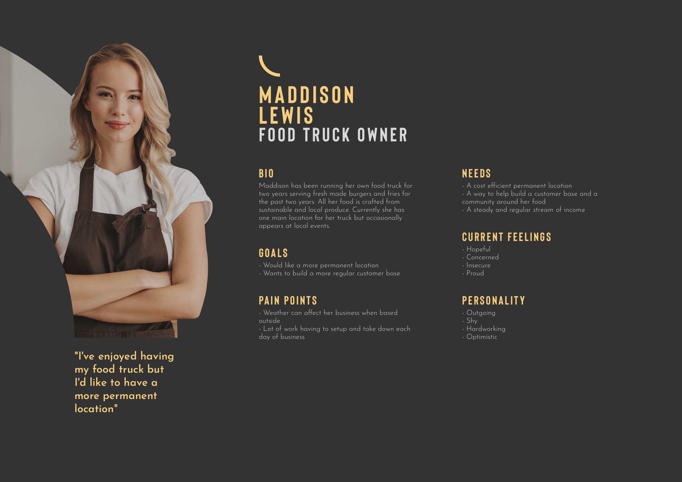
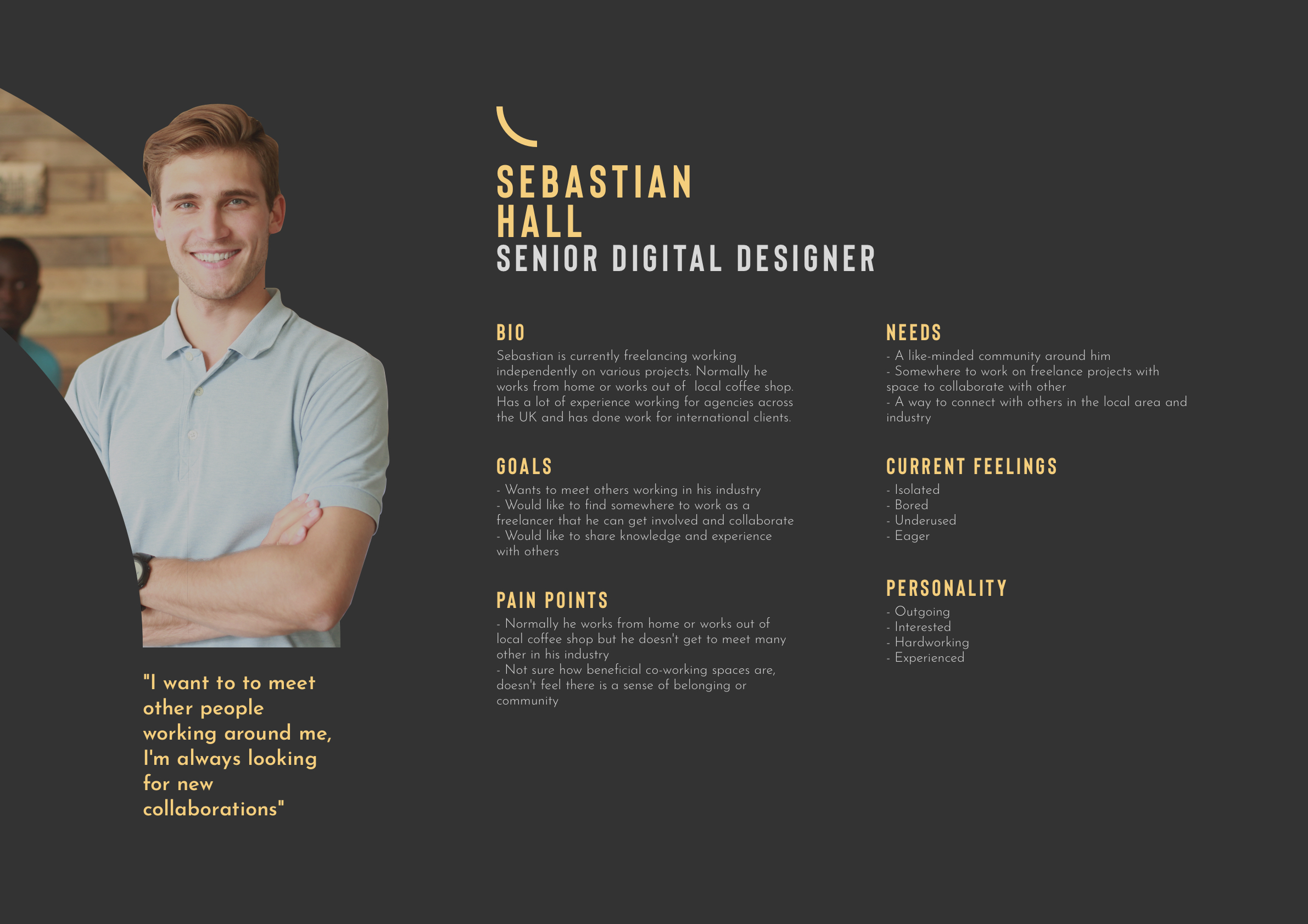
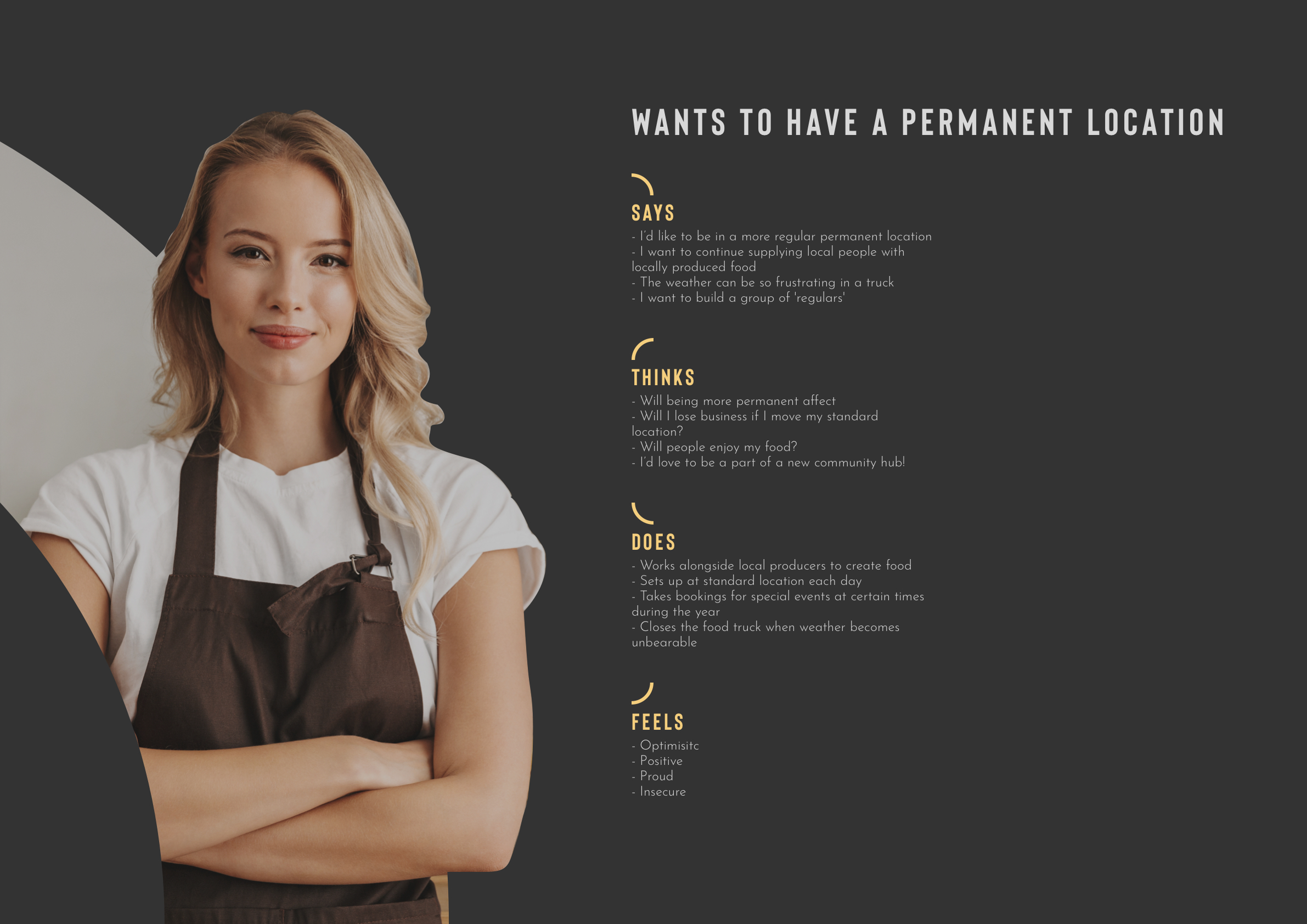
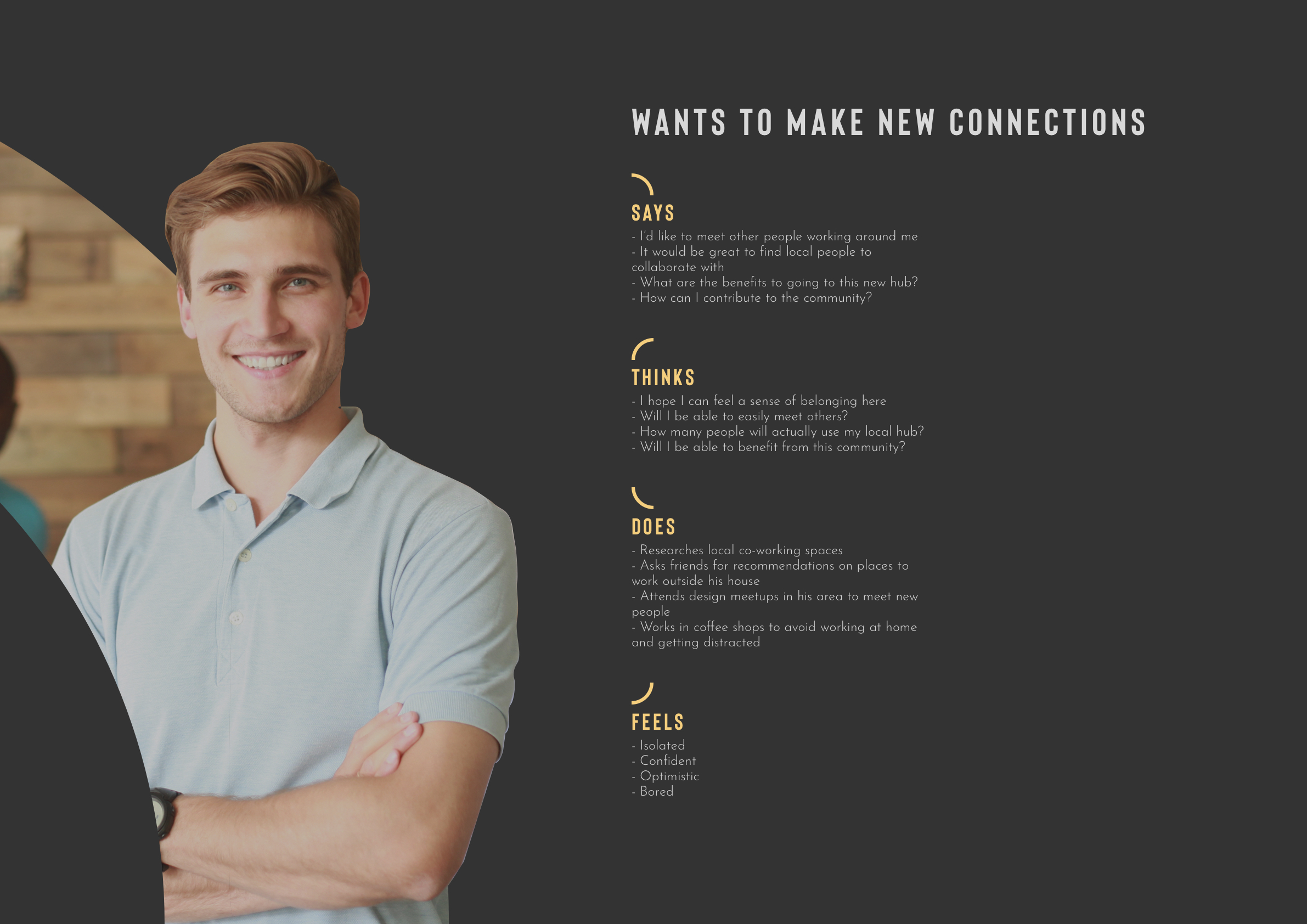
This combination spawned the concept of a high-end food court, a co-eating space, similar to those of co-working spaces that are popping up across the UK. These would be housed in newly regenerated buildings in the city. The spaces would provide a place for people working to purchase or bring their own lunch and form connections in the industry.
Idea 2
Elderly + Parks + Restaurants
This combination gave the idea for the pensioners pop-up park. To help allow elderly to connect with the community and get out of houses and care homes, partnerships with local restaurants would allow for family-style meals to be served in a local park encouraging community and collaboration. This could also give way to partnerships with other local groups such as schools and musicians to provide entertainment at these events.
Idea 3
Nurses + Local + Food Trucks
Nurses and other health care professionals can often miss or skip meals due to their workload. These three items formed the idea to rotate food trucks between hospitals at timed intervals that match up to the schedules of those working. Whilst this can allow them to get food at a convenient time, it can also create a delightful experience due to the variety of food being served from food trucks now
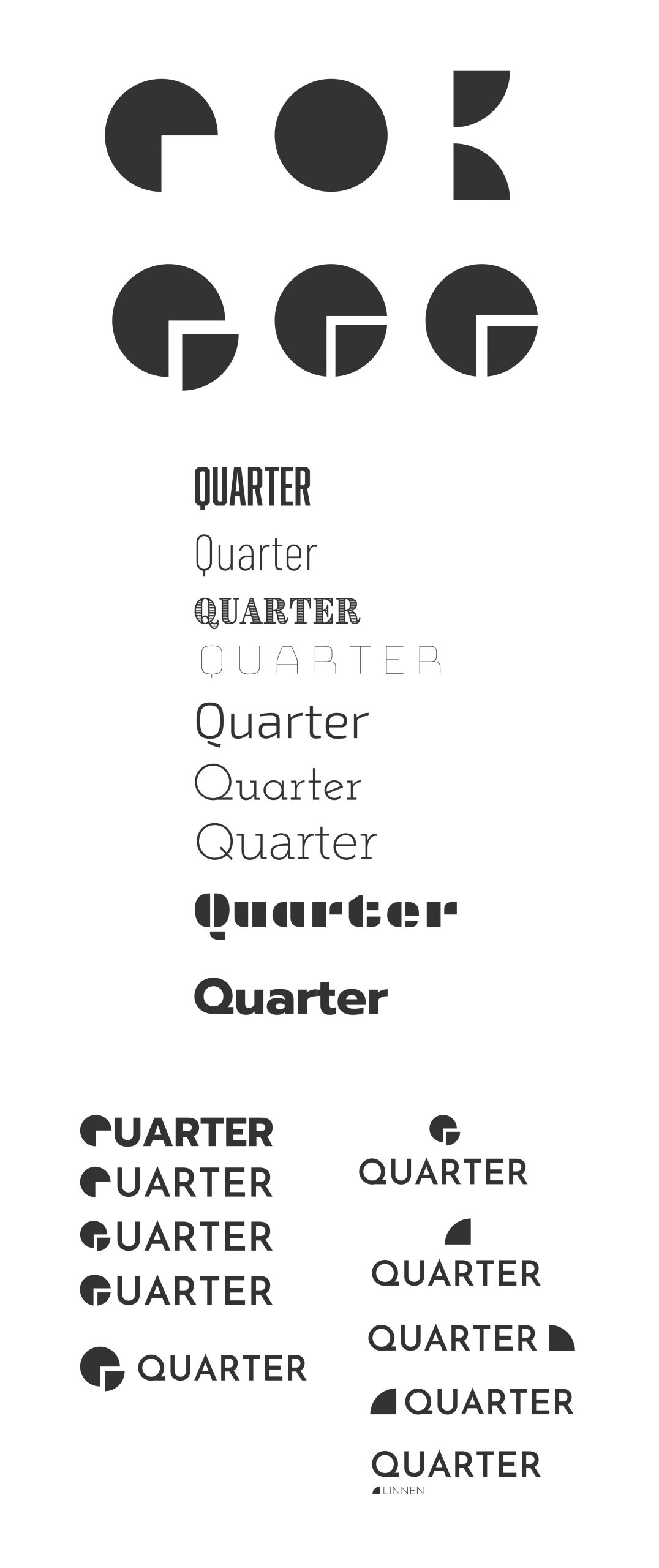
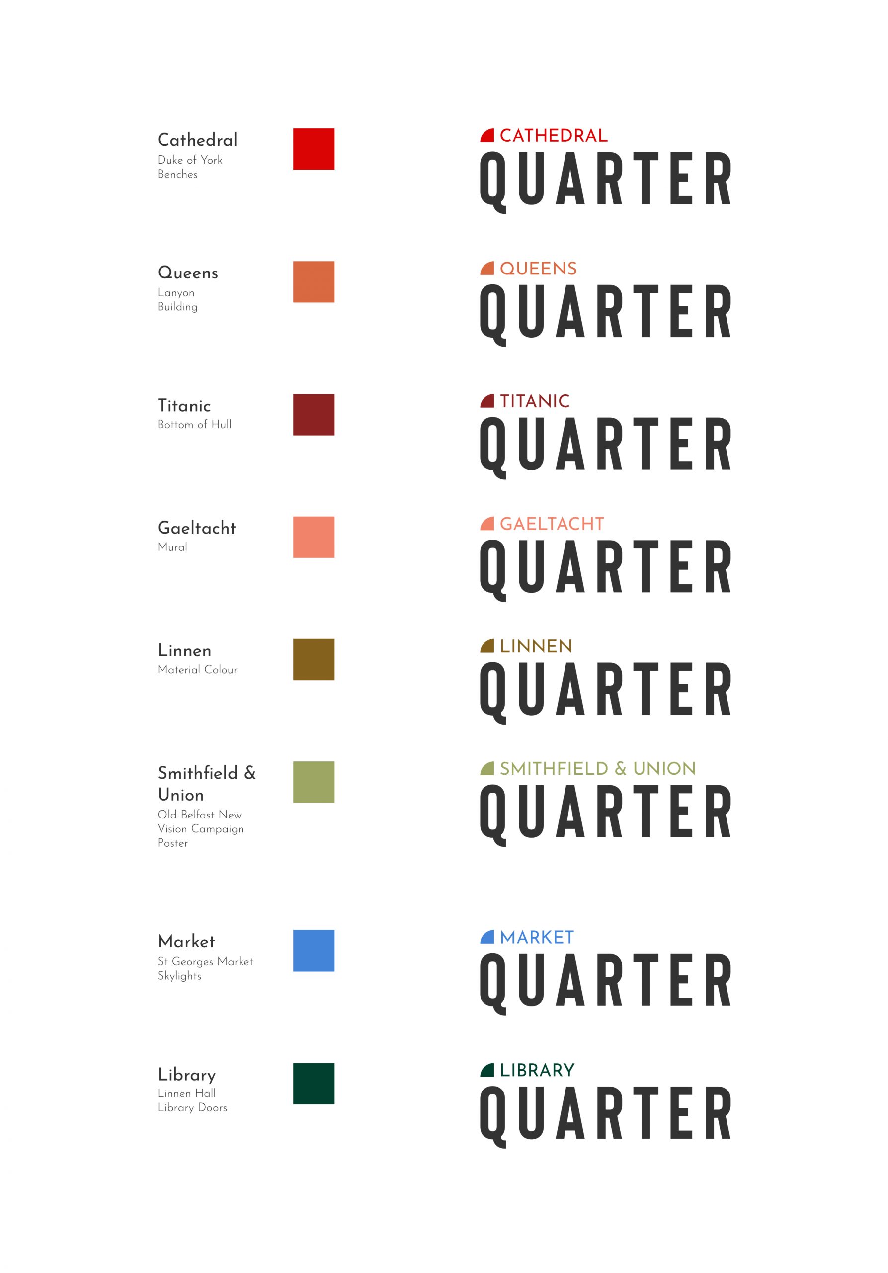
Belfast is known for it’s distinct areas know as quarters. Ironically, there are eight quarters in Belfast currently with a ninth soon to be added. They are Cathedral, Queens, Titanic, Gaeltacht, Linnen, Smithfield & Union, Market, and Library. Each quarter has a range of businesses in it as well as a unique style of architecture and vibe. These quarters provide a great series of locations to plant the co-eating spaces in. It also provides an intuitive name for the series of venue, Quarter. This both gives the impression each is based in a district of the city as well as provide a hub for each quarter.
This name inspires distinct imagery and shapes related to this name. After researching into various meanings and uses of the word quarter, I began to look at the branding for Quarter. Starting with typical shapes and the variations of it. I also looked into the typography to be used as this will need to link well with the shape. I tried different variations of type with the quarter symbol in an attempt to find the beginnings of the brand.
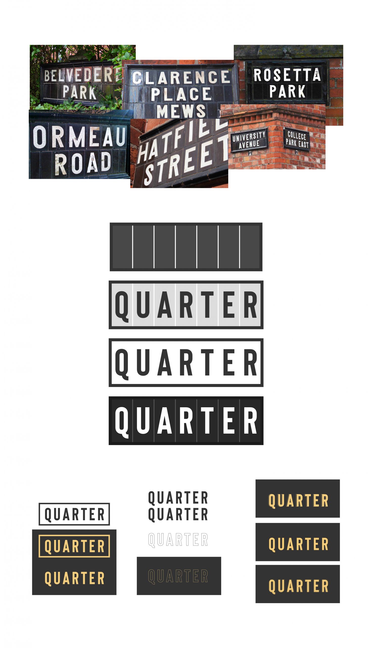
To help continue the refinement of the brand and to push it further, I pulled a card from the Oblique Strategies deck created by Brian Eno. These cards help to unblock creative issues and invoke new perspectives on a project, each card can be interpreted differently by individuals making the solutions interesting and challenging. This was the inspiration needed to move the brand on further. The card picked read ‘use an old idea’. This led me back to my initial research and when thinking about Belfast city I thought about the iconic ceramic street signs seen across the city. I gathered images of some of them to understand their form and typographic style. This helped to provide inspiration for the next wave of iteration.
By recreating a version of one of these signs, it allowed me to get a sense of where the brand could begin to head in it’s style.
Through research into typefaces I came across Bison, reminiscent of the art nouveau era and similar to that used on the street signs. Whilst retaining classic style, it has been tweaked to bring in modern influences making it a great fit to use for the Quarter brand.
Whilst thinking more about the various quarters within Belfast, it raised the question about how each hub could be distinctive.
Exploring these quarters provided some distinct colours such as the red benches outside the Duke of York bar or the orange bricks making up the Lanyon Building at Queens University. In an aim to explore how these names and colours could integrate with the Quarter branding I coloured the name of each quarter along with a quarter symbol to see how this could work to distinguish individual locations.
I like the intention behind this idea but when reflecting on it I don’t feel this is the right look for the brand. I will keep this idea for consideration to maybe be used in an adapted format that works better for the brand.
Continuing to iterate on the brand helped move it in the right direction. It gave some new options to consider and work with.
Looking more at the quarter symbology too along with how it works with the type. I pursued variations of this and looked further into the brand extensions in terms of how it could potentially be used for artwork and marketing.
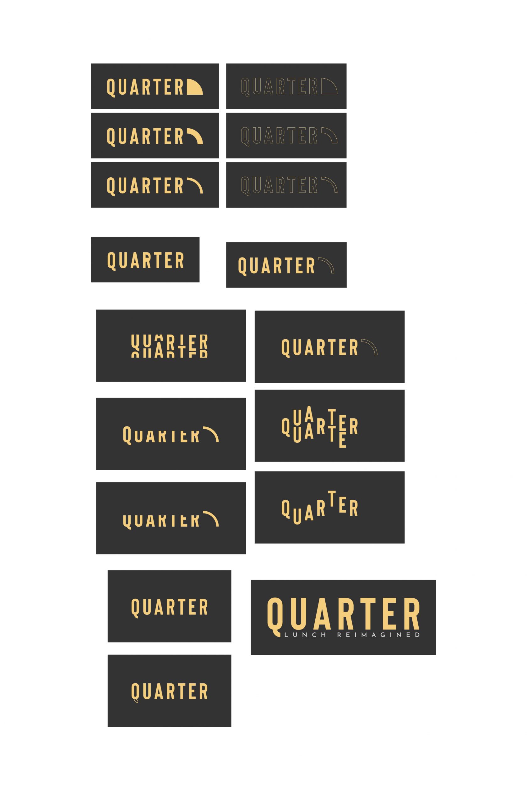

Whilst working through the brand, I consulted with some other designers in the industry leading me to explore the warping of typography to form the quarter symbol seen in some of the iterations. This is an interesting concept especially for the imagery it brings with it. This branding would be very distinct and recognisable but may prove challenging when working with or creating other brand elements. From an accessibility point of view, it may not connect well with some audiences due to it’s warped shape. It is still an interesting concept that is worth considering and exploring further.
Final Outcome 

InVision Prototype: Snö App