Personal Branding
Designing the look for myself as a brand
Overview: Starting with nothing, the idea was to create a brand for myself. I wanted something that seemed professional and clean to reflect my style and quality of work
Additional Assets: Brand Guidelines
Created: January 2017
Skill: Branding
Role: Designer
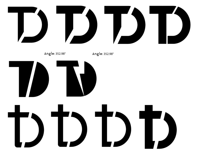
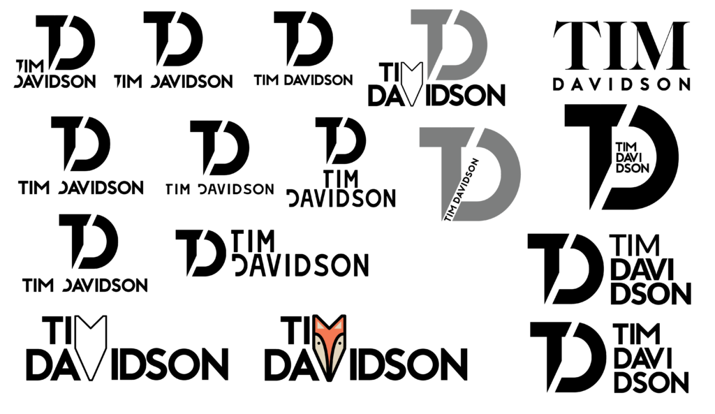
These are some of the preliminary digital concepts I had created and put together. I tried with both lower and uppercase letters and discovered that I preferred the overall look of the uppercase lettering. It gave a cleaner and more contained look. I made the decision to develop the designs from the first column further and refine them until I achieved a look I was happy with.
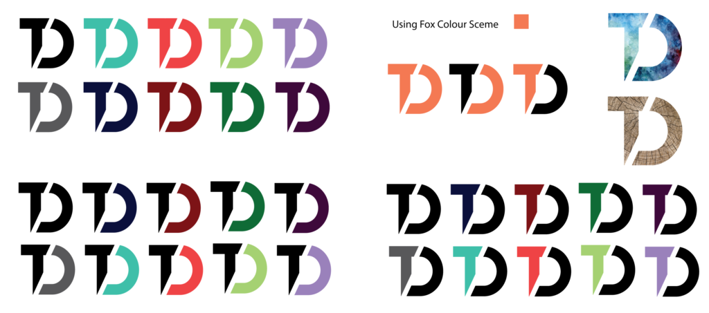
I looked into colour palettes for my personal branding, discovering how they came together and how they would represent my brand. I experimented with different colours and combinations including colouring individual parts of the monogram. I also tried the same colours both a light and dark version of each colour.
I added some patterns to a couple of the monograms. This worked but it didn’t work with my brands style. I tried also used the ‘fox colour scheme’. This was a reference to a concept for my visual marque which was the face of a fox. The idea was to achieve consistency across my brand.
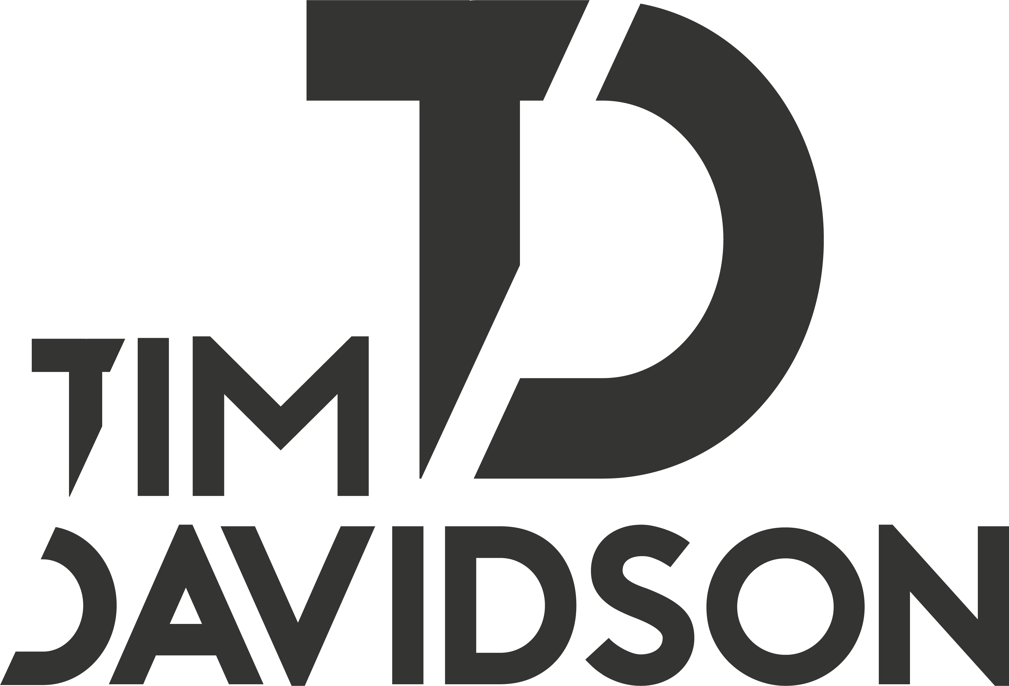
I played around with many different variations and styles for my wordmark. I discovered ways that don’t work well and new ideas that I really liked. The wordmarks on the left hand side were at the time my favourite and suited the branding well. They make use of the distinct shape of the letter D seen in my monogram.
During this process, I inadvertently created a visual marque seen at the bottom of my designs. This takes the form of a fox made by merging the letters M and V in my name.I chose to pursue this design and work on refining it.
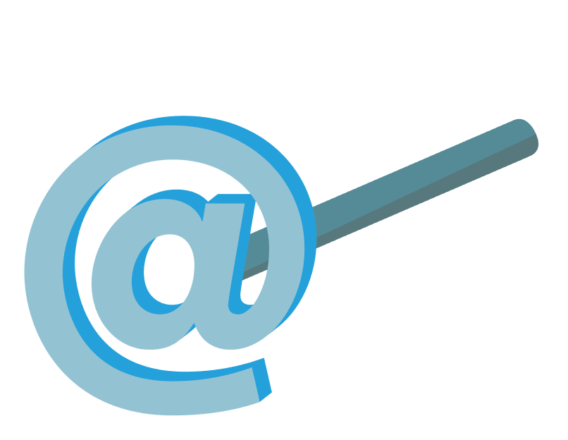
This was the original idea for my visual marque. The idea behind it was a literal brand made using the @ symbol which represents the internet. This combined the two things I would like to put a focus on which is branding and using digital mediums. It also had connotations of making things my own and giving them a mark people would recognise.
I had been refining my ideas for my visual marque that represents me. I started out with the fox but this animal didn’t exactly portray positive ideas. Sly and crafty aren’t the best words to describe my personality or style.
When thinking of other animals that have a similar makeup I decided on a wolf. I then developed this idea in a similar style to the fox and refined the overall shape to allow it to link in together as seen in the seamless pattern above. The ideas associated with a wolf are mainly that they can strive as a lone wolf, or by integrated with a pack. This could show my ability to work well alone or as part of a bigger team.
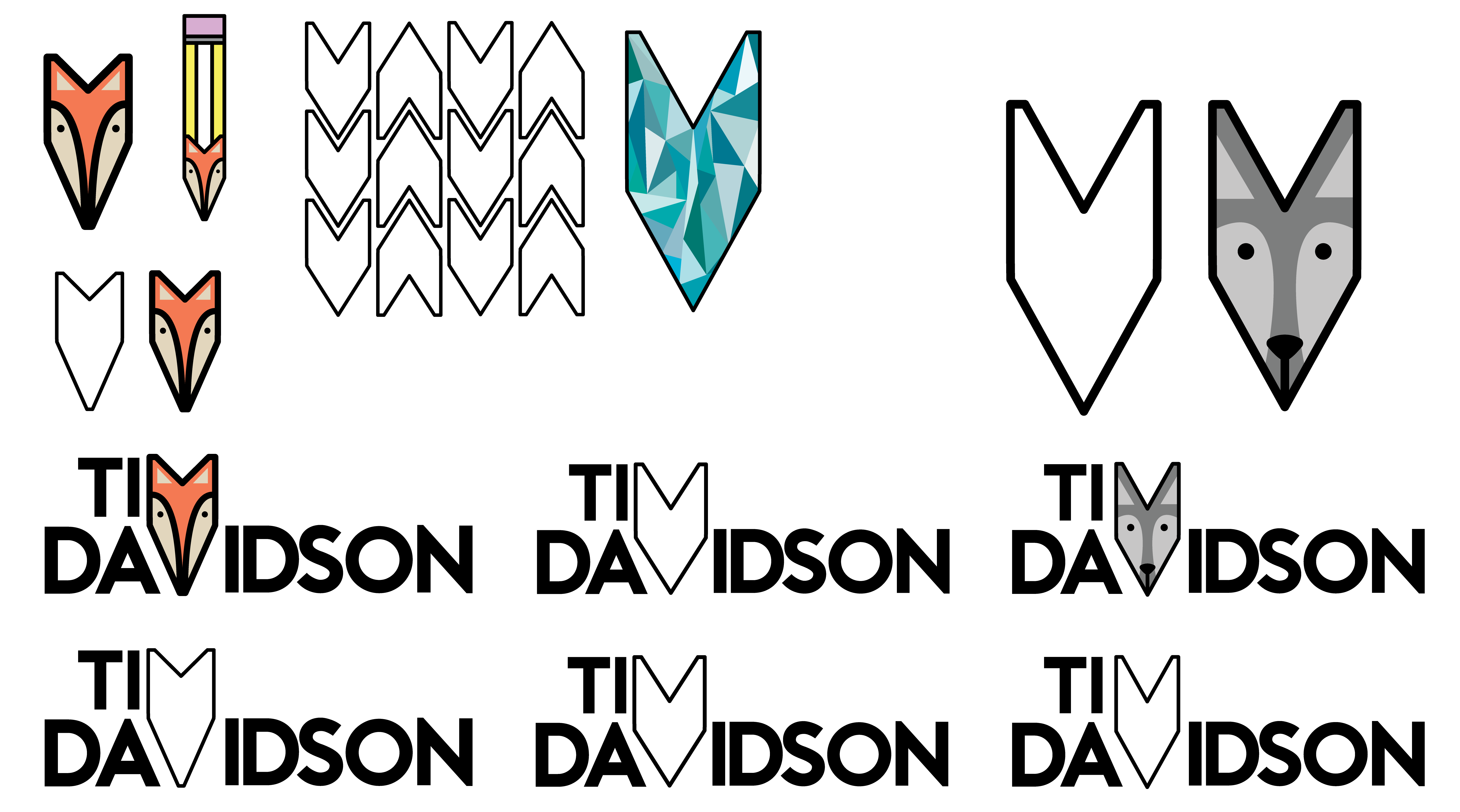
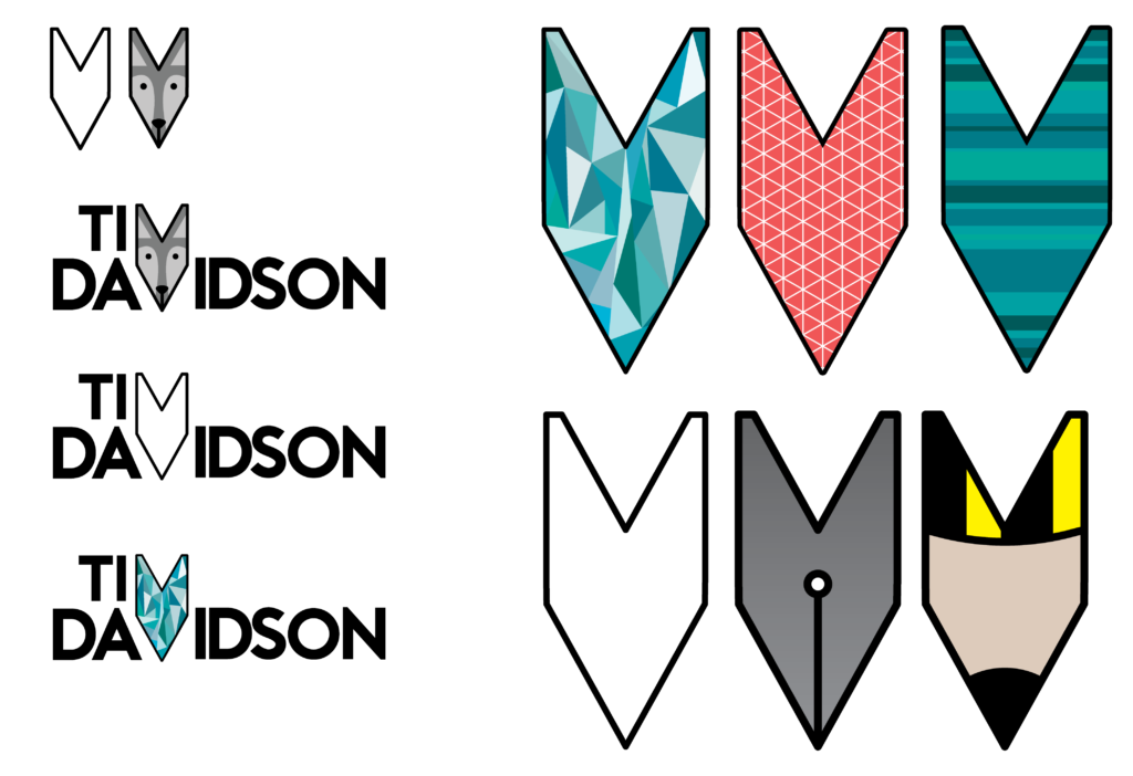
My visual marque is a very simple shape made up of the M and V from my wordmark. I have shown some of the variations on my visual marque as I my intention would be to have it as a dynamic brand that changes depending on the context. The change could indicate a different project or style of work I am doing hence the paintbrush, pen, and pencil. You can also see my original fox and updated wolf idea for another marque.
Final Outcome